Last updated on February 10th, 2022 , 06:38 pm
The CBOE VIX Index is an index that tracks the 30-day implied volatility of the options on the S&P 500 Index. Since option prices are an indicator of fear or complacency in the marketplace, the VIX is sometimes viewed as a “fear index” that gauges the level of uncertainty in market participants.
The VIX can also be used to make decisions regarding option strategy selection. For example, some traders prefer to implement short option strategies when the VIX is high because it is an indication that option prices are more expensive, and therefore there’s more profit potential from the selling side.
Conversely, when the VIX is at very low levels, it is an indication that option prices are cheaper, in which case some traders prefer to implement option buying strategies because there’s less loss potential compared to buying options when implied volatility is high.
In regards to trading the VIX, the index cannot be traded directly. However, traders can gain exposure to movements in the VIX by trading VIX options, futures, and other products related to performance in the VIX.
Historical VIX Index Movements
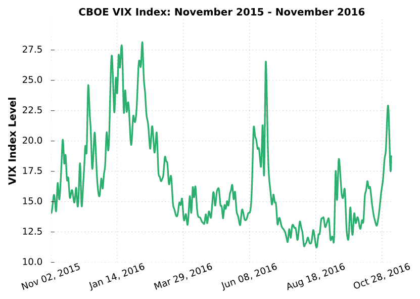
To better understand the VIX, let’s walk through some visualizations that demonstrate its movements, as well as how it tends to change relative to the overall market (the S&P 500). Here’s a chart of the VIX Index closing prices from November 2015 to November 2016:
As you can see here, the VIX over this one-year period closed between 11.34 and 28.14. But what does the actual VIX number mean?
The VIX number itself represents the one standard deviation expected range (in percentage terms) for the S&P 500 over the next year.
For example, if the VIX is at 20, that represents a 20% one standard deviation expected range for the S&P 500 over the next year. As a recap, a one standard deviation range encompasses approximately 68% of the expected stock prices in the future.
The following demonstrates how the VIX index level translates to various expected ranges for the S&P 500 (SPX):
Let’s walk through what each of these scenarios represents in terms of probabilities:
With the S&P 500 at $1,500 ➜ A VIX of 10 implies a 68% probability that the S&P 500 will be between $1,350 and $1,650 (±10%) in one year.
With the S&P 500 at $2,000 ➜ A VIX of 30 implies a 68% probability that the S&P 500 will be between $1,400 and $2,600 (±30%) in one year.
With the S&P 500 at $2,000 ➜ A VIX of 50 implies a 68% probability that the S&P 500 will be between $1,000 and $3,000 (±50%) in one year.
For other specific levels, the following formula can be applied:
As demonstrated in the table above, a higher VIX indicates that the 30-day S&P 500 options are pricing in a larger expected range for the S&P 500 in the future. Furthermore, a larger expected range indicates more market uncertainty. So, when the VIX is trading at lower levels, the market is more complacent because the options are pricing in less significant price swings.
Conversely, when S&P 500 options surge in price, the VIX spikes to higher levels, indicating that market participants are more fearful because the option prices indicate greater expected price swings.
VIX Index vs. the S&P 500
At this point, you understand the basics of what the VIX Index represents. Next, we’ll discuss the general relationship between the VIX and the S&P 500.
Historically, market participants have become much more fearful when the stock market falls in value because most people own stocks. Conversely, when the stock market is bullish, market participants are calm and complacent. Since investors tend to buy a lot more options when they are fearful, the VIX tends to rise when the stock market falls, and fall when the stock market rallies.
The following chart analyzes the relationship between the closing prices of the S&P 500 and the VIX over the period of November 2015 to November 2016. Additionally, it demonstrates how a change in the VIX translates to a change in the future expected range for the S&P 500:
As we can see here, the S&P 500 falls from $2,100 to $1,900 in shaded region A. Over the same period, the VIX rises from 15 to 28. In shaded region B, the S&P 500 rises from $1,850 to $2,075. Over that same period, the VIX falls from 28 to 14.
On the lowest subplot, we can see that an increase in the VIX from 15 to 28 (shaded region A) results in the 1-year expected range increasing from ±300 to nearly ±550, which is a massive increase in the market’s expected movement! On the other hand, we can see that a collapse in the VIX from 28 to 14 results in the 1-year expected range falling from nearly ±550 to ±300.
The previous chart demonstrates that the VIX and the S&P 500 have a very clear inverse relationship. To find out how clear, we visualized the one-month correlation between the VIX Index and SPX from December 2015 to November 2016:
Historical CBOE VIX Index Levels
In this section, we’ll take a brief look at historical VIX levels. The following chart visualizes the highest, average, and lowest, closing VIX levels since 1990:
As illustrated here, the VIX is below 20 most of the time. In fact, 61% of the VIX closes have been below 20 since 1990. However, when the VIX does rise, it tends to do so very quickly.
Another important point worth mentioning is that the VIX Index is often said to be “mean-reverting,” which means that when the VIX surges to significantly high levels (above 25 or 30), or falls to low levels (below 15), it will eventually return to a more “normal” level. The mean-reversion of the VIX Index can be explained by the ebbs and flows of fear and complacency in the marketplace.


